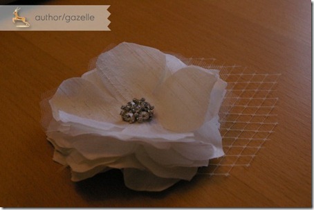
In my last post I showed you my hair flower, not let’s talk about how I made it!
First off, here’s what I used:
-
Silk dupioni (I bought 0.4 meters, but 0.2 meters would have been plenty)
-
Tulle (0.2 meters)
-
French veiling (1 yard, 9 inches wide, purchased from
GS Boutique on etsy)
-
Vintage rhinestone pin
-
-
-
-
-
Needle, pins, matching thread, scissors

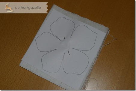
First up, I cut the silk into strips just wider than the flower, folded it up and pinned the template to it. I wound up using about 9 layers of silk flowers as I wanted a full flower, but I didn’t want so many layers that the fascinator would be really heavy and prone to falling out or weighing down my hair. I then repeated the process with the tulle. I used two layers of tulle between each layer of silk.
The silk I used was prone to fraying at the edges, so I decided to use fray check around the edges of each flower. The fray check also has the benefit of giving the flowers a bit more structure so you can define the layers rather than having them flop down against each other.
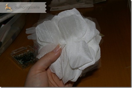
 I then assembled all of the layers, making sure the layers didn’t align perfectly and alternating two layers of tulle between each layer of silk, finishing with silk on the bottom.
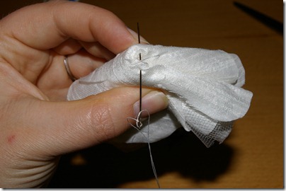
I then ran a few stitches through the center of the flower. Now fold the flower in half, and then in half again, with the bottom layer staying on the outside of the fold. Run a few stitches through the corner of the fold to help give the flower a bit more shape. Unfold.

 Turn the flower over to attach your embellishment to the top of the flower. The benefit of using a brooch was that I could just thread it through the center of the flower.
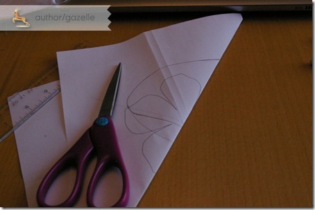
 Now it was time to design the French veiling leaf for the flower. I drew a leaf on another copy of the template.
 I wanted the leaf to be symmetrical so I folded the paper in half and only drew half the leaf. I wanted to curve the bottom of the leaf that would attach to the underside of the flower so I grabbed my compass from university. This is by no means necessary of course. Fold in half and cut!
 I then pinned the leaf to the veiling, making sure the tip of the leaf lined up with one of the tips of the diamonds in the veiling. Trim.
 I attached the veiling to the back of the flower with just a couple of stiches. It will get tacked down a bit better soon.
 I needed a way to attach the hair clip to the back of the flower so I cut out a circle of silk big enough to attach the clip to.
 I used fabric glue (Fabri-Tac) to attach the top of the clip to the fabric circle. Once it was dry I put a spot of glue in the center of the circle and a ring of glue around the outside.
 I glued the circle down, making sure there was enough play to allow for popping the clip open and closed.
 And that’s it! At the hair trial I’ll determine if I need to add in a few stitches here or there but I honestly think it is good to go (that Fabric-Tac is strong stuff).
 And here’s a cost breakdown for the project! I’m not including the cost of the fray check, fabric adhesive and basic sewing notions since I already had those on hand.
Hair clips = $1.05
Silk dupioni = $11.76 (and I could have sufficed with half the amount I purchased)
Tulle = $1.05
French veiling = $3.71
Rhinestone pin = $10.45
TOTAL = $28.02
I hope you found this tutorial useful! Have you thought about trying to make your own bridal accessories?


 Image via