Showing posts with label the invitations. Show all posts

Wednesday, June 8, 2011

Tallying the RSVPs

Remember the Gazelle invitations?  If not, that’s okay.  Here are a few pictures to refresh your memory.IMGP3279IMGP3308I promised to come back and tell you why our RSVP date was so far in advance of our wedding…IMGP3311…an to break down the costs for you and to share some fun tidbits about our RSVPs.  Plus we can now chat about our RSVP stats!

It was a lot of fun checking the mail every day from the the moment our invitations went out, all the way to when our RSVPs were due.  A few guests left us a little message on the card exclaiming how much they are looking forward to our wedding.  A couple folks got out their markers and sent their RSVP back with a bit of flair.IMGP3552How many blank RSVPs did we receive?  Three.  When the first one arrived I gleefully exclaimed to Mr. Gazelle, “Get the black light pen!  We’ve got a blank one!!”  That black light pen totally paid off.  The only downfall was when one guest grabbed their roommate’s RSVP card, didn’t sign their name and sent it back.  It was awhile before we realized the mix up.

So why was our RSVP date so far in advance?  Because we had to make a full prepayment to our venue one month before the big day.  I wanted to have fairly firm numbers so that I could feel confident writing a cheque to our venue knowing that the number would be unlikely to change very much after the fact.

How did our numbers work out?

  • Total number of people invited: 74
  • Number accepted: 54
  • Number declined: 18
  • Number we are still waiting on: 2

The local versus the out of town equation:

  • Number of locals accepted: 13 (17.6%)
  • Number of locals declined: 0 (0%)
  • Number of OOT accepted: 41 (55.4%)
  • Number of OOT declined: 18 (24.3%)

Our farthest guest is 4000 km away in Kentucky, although Sarnia, ON (3900 km) and Dallas, TX (over 3800 km) are close contenders for farthest away.  Our closest guest is only 20 km away from our venue. 

Our invitations wound up costing $202.70 for 40 invitations ($5.07 each).  With postage we were around $280 ($7.00 each).

There we go, the final breakdown on the Gazelle invitations!  It is so hard to believe that we are getting married NEXT month.  Where has the time gone?

Did you calculate the stats on your RSVPs? Smile

Saturday, April 23, 2011

You’ve Got Mail!

Guess what hive, you’ve got mail!  Your invitation to the Gazelle wedding has arrived!IMGP3272We went with a square invitation so we used 6-1/2” square matte linen 80 lb. brilliant white envelopes.

I love the look of wraparound address labels.  I wanted to tie them to our envelope liners so I scanned our envelope liner paper into a jpg.  I then used it as a border for our address labels that I set up in PowerPoint.  Can you see the bikes?IMGP3234To address the labels I used the Pea Catherine font from Fonts for Peas.  I loved the handwriting feel of the font, yet it was still easy to read.

Let’s flip the invite over shall we?IMGP3276IMGP3238I wanted to make the envelopes easy to open so that our guests would be sure to see the envelope liners.  I had some custom stickers made up by Vistaprint with a bike on it.  I’m sure you are wondering why I had Vistaprint make the stickers instead of doing them myself.  We own a laser printer and I could not find round labels for laser printers, only for ink jet printers.  Since a laser jet printer gets hot I was worried that the ink jet labels would get ruined in the printer.  I wasn’t willing to risk spending cash on an entire package of labels in case they wouldn’t work with our printer.

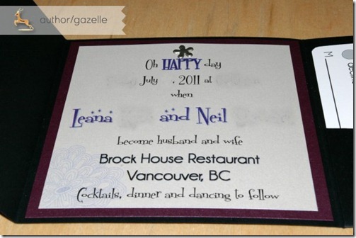
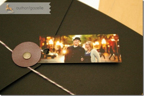
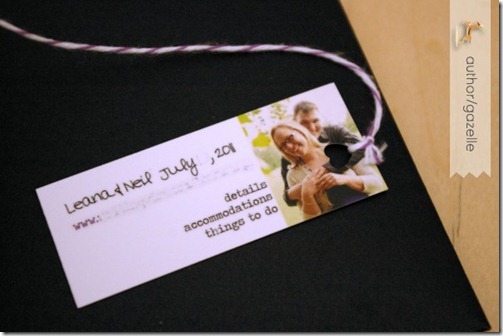
Let’s pull the invitation out of the envelope now.IMGP3279We went with a black matte 6-1’4” square pocket fold.  For the closure I used a circle of purple cardstock attached with an eyelet.  Purple and white bakers twine wound around the eyelet to hold the invitation closed.IMGP3248IMGP3250Attached to the end of baker’s twine is our mini moo card.  We used a heart shaped hole punch to create a hole to thread the twine through.  On the back of our mini moo card we had a link to our website where we give all kinds of information on where to stay and what to do while in Vancouver for the wedding.IMGP3252Here’s a peak inside our invite:IMGP3308
Oh HAPPY day…when Miss Gazelle and Mr. Gazelle become husband and wife
Brock House Restaurant
Vancouver, BC
Cocktails, dinner and dancing to follow”

The majority of the font on the invitation is in Fontdinerdotcom from dafont.  Our names are in Fontdinerdotcom Sparkly which have the added stars on top of the font.  Brock House is in Champagne & Limousines.IMGP3304What you can’t tell on the photo is that the invitation is printed on the most lovely shimmery quartz white text weight paper.  I absolutely love it.  It is glued to a dark purple shimmery cardstock.  For a little bit of visual interest there is a faint floral watermark in the bottom left corner.IMGP3306At the top is a pewter floral brad.  On to the pocket fold side! IMGP3293I tied in our bicycle theme with our embossed bicycle stamp (which matches the graphic on our circle sticker).  I ultimately went with the pearly white embossing powder over white ink.  I thought that it showed up the best on the dark cardstock and I loved the look of it the best.  Inside we have a map!IMGP3271I traced a map of Vancouver and included the major roads and pointed out some of our favourite spots including Granville Island and Stanley Park.  I coloured the map in with pencil crayons, scanned it and then printed multiple copies at home on high quality glossy paper.

*Funny side story: I spent the better part of a week printing and trimming all of the components for our invitations.  Mr. Gazelle printed and trimmed the maps.  I got a text message from him complaining that the trimming took forever.  Somehow I didn’t have much sympathy…but that meant he was doing it right.  Thanks for your help Mr. G!

And last off, our RSVP card!IMGP3311Rather than printing these up myself I chose to take advantage of another freebie event from Vistaprint.  The coloured, glossy front of the card had our address on it.  The back black and white side had our RSVP information on it.  The floral graphic ties in to the watermark on our invitation.  BM-D also had a corner rounder that she lent me for us to use.  I love the touch the rounded corners gives to our postcards!

I plan to chat about why our RSVP date is so far ahead of our wedding, fun things about some of the RSVPs we’ve gotten back, any regrets, and I’ll talk about a cost breakdown for the invitations.  I’m really happy with how our invitations turned out.  I think they really represent us and our wedding.  I definitely am glad that I chose to DIY our invitations!

Did you decide to make your own invitations?

Saturday, April 16, 2011

How now moo cow?

I totally fell for mini moo cards.  I blame Mrs. Pretzel’s invitation suite for that one.

5173489Image by Mrs. Pretzel on weddingbee

I thought this might be a great way to incorporate our engagement photos into our invitation suite.  In case you have never ordered moo cards here is the dealio.  You can use up to 100 different pictures for the front of the card, but the same design will be printed on the back of each card.  Perfect for showing off engagement photos on the front, yet displaying helpful information on the back of each card. 

The online software is so easy to use and it shows you the bleed (or non-safe) area for the front of the card.  For the back I chose to create my own design using their template as a guide:

minicard_template_usImage via us.moo.com

I was so excited when these little guys arrived in the mail.  Want to see?IMGP3101IMGP3104

We chose to go with 8 different engagement photos:IMGP3106IMGP3107

And then put a link to our website on the back of our cards:IMGP3109-edit

I did make one mistake though.  The way our pictures on the front worked out meant that I would punch a hole on the left side of the card.  On the back that meant punching a hole through our picture.  In hindsight I would have moved our picture to the left on the back of the card. 

Speaking of punching…IMGP3111…is that a heart shaped punch I spy?

As for the cards themselves, the paper is thick and of fantastic quality.  Shipping to Canada was reasonable and the turn around time on my order was faster than initially promised.

Are you bombarding your guests with your engagement pictures like we are?  If so, how are you doing it?

All engagement photos on our moo cards are by Sakura Photography.

Saturday, April 9, 2011

I’ve been invited!

I’m so excited you guys – I’ve been invited!  My super awesome maid of honour and bridesmaid are planning my bridal shower.  The girls know that I love tea.  This is my shelf at work, full of a ridiculous amount of loose leaf tea.DSCN4917

I also love me a good afternoon tea!  We celebrated MOH-T’s birthday a few years ago (when she was prego with my niece) with afternoon tea at the Fairmont in Banff Springs.Banff Tea 001

And my mom and I got off a red eye flight and went straight to tea at the Chateau Frontenac in Quebec City a few years ago.Quebec City 08-08 008

The girls were savvy and knew that a tea themed bridal shower would be totally up my alley.  They were so creative with the invitations and I may have squealed as I opened it up. 

IMGP3168Put on your hats, gloves and pearls
It’s tea-time for the girls
In honour of
Miss GazelleIMGP3169The back of the invitation…  Can you spy our bicycle stamp that was used as a watermark on the paper?
IMGP3171Need an excuse to go shopping?
Prizes will be awarded for best tea-time ensemble.IMGP3172

And a tea bag inside with all of the details printed on its tag.  Seriously, how creative were the girls?  I absolutely love it.  Thanks ladies!!!

Time to find me a hat….I wonder if Kate Middleton has one she can lend me?

Were you bowled away by your bridal shower invite?

Monday, April 4, 2011

And they’re off!

This past week has been all about one thing, and one thing only.

The Gazelle invitations!DSCN4922-edit

Putting those babies in the mail at 8 am this morning felt sooooo good.

I am so proud of how the invitations turned out.  I can’t wait to reveal them to you as soon as they start arriving in our guests’ mail boxes!

Tuesday, March 22, 2011

Glowing in the Dark

I am slowly but surely getting ready to start making our invitations.  I’ve ordered the paper supplies, RSVP postcards, and various bits and bobs.  Everything should be here in the next week or so and then it will be time to get to work!

I decided on a covert plan to identify any RSVP cards that may come back without any respondents’ names.  I ordered a black light pen!  I plan to number each RSVP card in invisible ink and keep a numbered list of our guests.  That way if we get any blank RSVPs back we’ll know who they belong to.

I bought mine from Glow Products, a company located in Canada.  It retails for the low, low price of $2.25 (+ tax and shipping) and it is a pen and light combo all in one.  Apparently it comes in a variety of fun colours?

Well, my pen just arrived in the mail and I had to chuckle as I pulled it out of the envelope.IMGP3125It has a crazy looking goat (I think?) on it.  And bananas?IMGP3117IMGP3118The goat is saying, “Hellow!!~ MY Friend”  Hee hee!

Of course I had to test the pen out and make sure it works.IMGP3120Yay, success!

Are you jumping on the black light pen bandwagon for your RSVPs?

Saturday, March 19, 2011

Never Give Up!

Or this post could alternately be titled:Picture1You may remember that a couple of weeks ago I decided to make a mock up of our invitations.  The only thing that I wasn’t happy with was my attempt at embossing.  Just to refresh your memory, here was the result that I wasn’t please with:IMGP3086I used white embossing ink with opaque white embossing powder.  I didn’t like all of the flecks of white embossing powder that clung to the black cardstock despite a vigorous tapping on the table and blowing on the cardstock.  I didn’t want to give up on the bicycle stamp because this was going to be my attempt to tie a lot of our paper products together.

My friend Julie suggested stamping with regular silver ink which sounded like a good compromise.  BM-D encouraged me to not ditch the embossing completely though because she really liked the raised texture.

I decided to try two different embossing powders – a purple and a pearly white.  First up is purple!IMGP3095This definitely looks a lot cleaner.  It is a little dark on the black cardstock in real life, although it does photograph really well!

Next up I tried a translucent pearly white embossing powder on white ink.IMGP3113This one also turned out pretty well.  I like the contrast between the white picture and the black cardstock.

I’m a lot happier with how these two different powders turned out.  The big question now is which one to go with?  Which do you prefer – the purple or the pearly white?

Monday, March 7, 2011

Embossing Fail

This weekend I finally got around to making a mock up of our invitations.  I ordered supplies ages ago from the absolutely amazing Paper Circle.  Paper Circle is based in Canada, has fantastic prices and some of the most amazing customer service I’ve experienced.  Plus their products are top notch!

I wanted to make a mock up so I could know if:

  • The design in my head would translate into the real thing like I hoped.
  • I could print on beautiful shimmery paper with our laser printer.
  • My ideas would work without having to sacrifice oodles of supplies.

All in all I was really happy with how my mock up turned out.  The laser printer did a great job on the shimmery paper.

There was however one thing that didn’t work out.Picture1Embossing was a bit of a fail.IMGP3086I love the idea of a white embossed graphic on black, but check out how messy it looks.  The edges are not crisp and there is white embossing powder flecked around the image.  After using the embossing heat tool to set the powder the cardstock warped.  I was not pleased with the result.

I’m worried about wasting a lot of cardstock to make the embossing work.  I’m also a bit of a perfectionist and I’m not so keen on sending the invite out if the embossing is going to look like this.  I’ve tried this stamp on different surfaces before (envelopes, magazines) and it turned out really well so maybe the powder is sticking to the cardstock?

I’m leaning towards ditching my plan to emboss something on our invitations.  Do you have any suggestions on what I can do to make this work?