Guess what hive, you’ve got mail! Your invitation to the Gazelle wedding has arrived! We went with a square invitation so we used 6-1/2” square matte linen 80 lb. brilliant white envelopes.
I love the look of wraparound address labels. I wanted to tie them to our envelope liners so I scanned our envelope liner paper into a jpg. I then used it as a border for our address labels that I set up in PowerPoint. Can you see the bikes? To address the labels I used the Pea Catherine font from Fonts for Peas. I loved the handwriting feel of the font, yet it was still easy to read.
Let’s flip the invite over shall we?
 I wanted to make the envelopes easy to open so that our guests would be sure to see the envelope liners. I had some custom stickers made up by Vistaprint with a bike on it. I’m sure you are wondering why I had Vistaprint make the stickers instead of doing them myself. We own a laser printer and I could not find round labels for laser printers, only for ink jet printers. Since a laser jet printer gets hot I was worried that the ink jet labels would get ruined in the printer. I wasn’t willing to risk spending cash on an entire package of labels in case they wouldn’t work with our printer.
Let’s pull the invitation out of the envelope now. We went with a black matte 6-1’4” square pocket fold. For the closure I used a circle of purple cardstock attached with an eyelet. Purple and white bakers twine wound around the eyelet to hold the invitation closed.
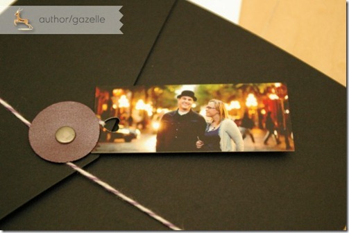
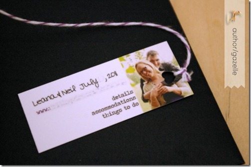
 Attached to the end of baker’s twine is our mini moo card. We used a heart shaped hole punch to create a hole to thread the twine through. On the back of our mini moo card we had a link to our website where we give all kinds of information on where to stay and what to do while in Vancouver for the wedding.
 Here’s a peak inside our invite:
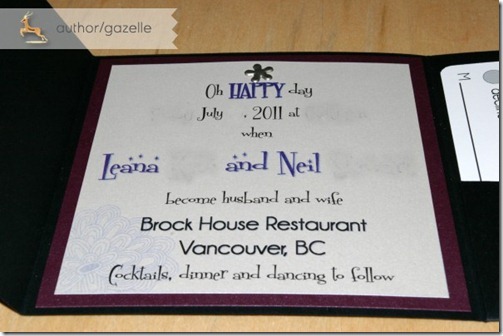
Oh HAPPY day…when Miss Gazelle and Mr. Gazelle become husband and wife
Brock House Restaurant
Vancouver, BC
Cocktails, dinner and dancing to follow”
The majority of the font on the invitation is in Fontdinerdotcom from dafont. Our names are in Fontdinerdotcom Sparkly which have the added stars on top of the font. Brock House is in Champagne & Limousines. What you can’t tell on the photo is that the invitation is printed on the most lovely shimmery quartz white text weight paper. I absolutely love it. It is glued to a dark purple shimmery cardstock. For a little bit of visual interest there is a faint floral watermark in the bottom left corner.
 At the top is a pewter floral brad. On to the pocket fold side!
  I tied in our bicycle theme with our embossed bicycle stamp (which matches the graphic on our circle sticker). I ultimately went with the pearly white embossing powder over white ink. I thought that it showed up the best on the dark cardstock and I loved the look of it the best. Inside we have a map!
 I traced a map of Vancouver and included the major roads and pointed out some of our favourite spots including Granville Island and Stanley Park. I coloured the map in with pencil crayons, scanned it and then printed multiple copies at home on high quality glossy paper.
*Funny side story: I spent the better part of a week printing and trimming all of the components for our invitations. Mr. Gazelle printed and trimmed the maps. I got a text message from him complaining that the trimming took forever. Somehow I didn’t have much sympathy…but that meant he was doing it right. Thanks for your help Mr. G!
And last off, our RSVP card! Rather than printing these up myself I chose to take advantage of another freebie event from Vistaprint. The coloured, glossy front of the card had our address on it. The back black and white side had our RSVP information on it. The floral graphic ties in to the watermark on our invitation. BM-D also had a corner rounder that she lent me for us to use. I love the touch the rounded corners gives to our postcards!
I plan to chat about why our RSVP date is so far ahead of our wedding, fun things about some of the RSVPs we’ve gotten back, any regrets, and I’ll talk about a cost breakdown for the invitations. I’m really happy with how our invitations turned out. I think they really represent us and our wedding. I definitely am glad that I chose to DIY our invitations!
Did you decide to make your own invitations?


4 comments:
Love it! Especially love your little engagement photo & the map. :)
Saw your facebook post and had to check out your blog. Those are the coolest invitations I've ever seen! Great job! I think you and your guests are going to have a blast at your wedding with all of your extra touches. Many blessings to the bride and groom. : ) Barbara Lewis
wow!! That is amazing! I love the heart shaped hole punch, didn't know they even had that! and the little tag on the outside. Sooo fantastic!
Post a Comment